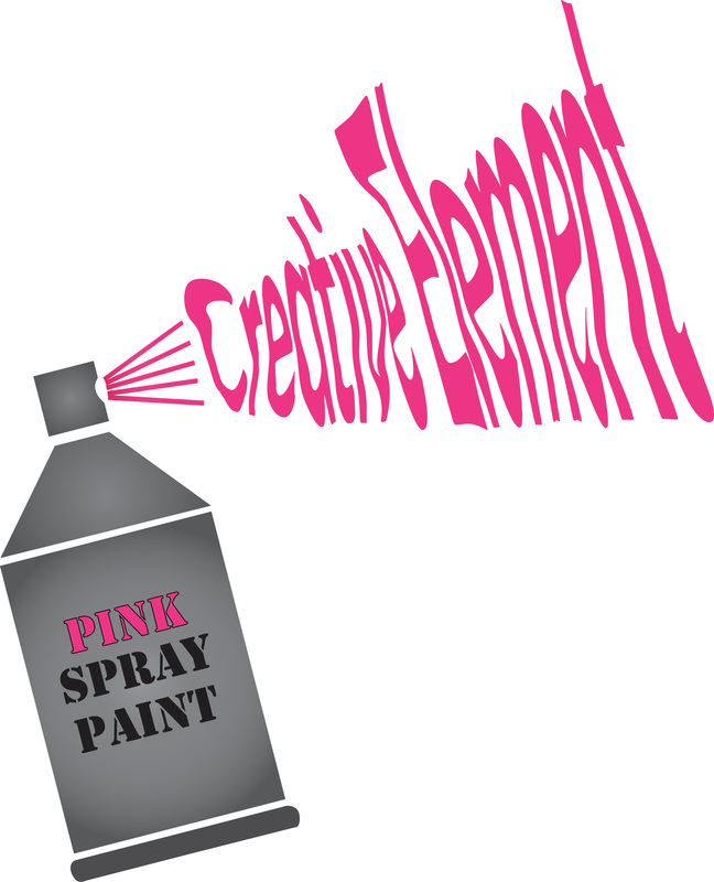
Final Project- Creative Element Logo
For the test we had to create a logo for an art gallery called Creative Element. My logo is simple because it does not have any overwhelming details. It is not difficult to remember which makes it memorable. "Creative Element" is supposed to be the words coming out of the can which is spray paint and that is what makes it memorable. It is versatile because you can put it anywhere and with the boldness of "Creative Element" you would still be able to read it. It will never be outdated because the paint can is simple and that makes it timeless. I chose a spray paint can to symbolize Creative Element since it an art company. This project taught me that anything is possible when you put thought into it.
Mailer Ad
For this project we had to create a mailer ad for a company. I chose the company "The Coffee Bean". We had to recreate a logo for our company and also include these things: the product, a headline, a body, an offer, a call to action, the logo, an image, the contact information, and also a space for place stamp here. I thought this project was kind of fun to get a feel of what it is like to actually make something we actually receive almost daily. I also thought it was fun to get to recreate the logo for an existing company.
Photoshop Project
We learned how to use Photoshop, and different techniques within it. The first project we did was to start with one image and remove an element and add an additional element to make it look realistic. The second one was to combine two images to make them to make a surrealistic image. The third one was typography combining text with images using clipping. Some of the tools we learned how to a variety of selection tools including the lasso tool, the direct select, and the magic wand. We also earned how to use the cloning tool and the fill content aware tool. I also used the burning and dodging tool to help create shadow within my surrealistic project.
Logo Designs
For this project we had to start with a basic symbol then we had to turn it into a logo. We had to manipulate it in order to turn it into a logo. We had to make the logo simple, memorable, timeless, versatile, and appropriate. For the first symbol, I used a basic fish. I turned the fish into three fish and into a market where you can purchase fish to eat. For the second one I used a leaf symbol and I turned it into a fall theme, using Autumn as the owner's name since it relates to fall. For the third I used a ribbon and turned it into a ribbon store and applied gradient to make it look like the ribbon was actually curved and parts were behind others. I felt as if my ribbon logos turned out the best even though they were the most complicated.
Buzz bee and reversed Typography
For this project we learned about typography. I put the word reversed backwards because to reverse means to go backwards. On this I also did a more complex type of typography and how to use the tool to distort each and every word buzz on my bee. I used envelope distort and make with mesh to distort each of these.
Gradient Mesh Cherry
In this project we learned how to use the gradient mesh too. It also taught us how to make water drops, and shade to look just like the original image. We also learned how to make the shadow on the bottom of the image. We used illustrator to make this project.
Dory Game Board Piece
For this project we had to recreate a board game. Our board game is called PixarLand based off of Pixar movies and the idea of CandyLand. To create the game board peices we used the program TinkerCad. I created Dory for my game board piece.
Creative Baby Dory
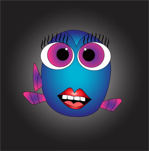
On illustrator, I created my own creative version of baby Dory. I learned how to use the pen tool to create the shapes with points. I also learned how to use the gradient tool to create the color effect.
